
Unconventional lyrics, infectious melodies and originality by the bucket load are seemingly the staple ingredients of a timelessly classic record, such as those compiled into this list, all cultural icons and unequivocally influential in their own way. But all too often I find, the album covers and accompanying artwork which aid many albums in achieving 'iconic' status as it were, get somewhat forgotten. So what exactly is it that makes an album cover 'iconic': a rigorous art direction team, endless stockpiles of cash, state-of-the-art cameras? Well the covers in this list certainly seem to say differently, armed with little more, than an incomparably unique concept and plenty of subliminal symbolism...
 An unconventional choice, perhaps to emulate the unconventionality of New Order's minimalistic and synth-drenched sound, their 1983 pièce de résistance, 'Power, Corruption & Lies', possesses an album cover which is interesting in that it seemingly seeks to divert as far away from the band's sombre roots, in their previous Joy Division days, as possible. The reproduction of Henri Fantin-Latour's rose painting was said by the cover's art director, Peter Saville, to suggest 'the means by which power, corruption and lies infiltrate our lives. They're seductive.' The implementation of such a dark and rich image, in contrast to the colour-coded alphabet featured to represent the band's name, most definitely reinforces this and creates for an overall sense of 'confusion' emitted by the both the album's cover and its music.
 A modern classic, steeped in hype from the British music press at the time of its release in 2001, and revered by Strokes fans and critics alike: 'Is This It' boasts the very pinnacle of New York's The Strokes' success, rife with infectious hooks and an undeniably raw rock 'n' roll vibe. The brusqueness and simplicity of the album's cover, a reportedly impromptu photo taken by photographer Colin Lane of his then-girlfriend, was selected and produced in strikingly minimal black and white, and was later stocked by major UK music retailers despite their concerns about its controversial nature (a slightly prudish viewpoint perhaps?).
8 ~ The Queen Is Dead: The Smiths
 Largely regarded as The Smiths' greatest export, their 1986 triumph, 'The Queen Is Dead' features a Morrissey-designed still of Hollywood great, Alain Delon from the 1964 film, 'L'Insoumis.' I like to think of this cover as a somewhat abstract match for the album's title, but I think that's what makes it quite so memorable (and who am I to question the great post-punk overlord Morrissey anyway?). The follow-up album to the widely-revered 'Meat Is Murder', the mixture of emotional ebbs such as the fan favourite 'There Is A Light That Never Goes Out' and deceptively upbeat numbers such as 'Frankly Mr. Shankly' is reflected incredibly acutely in the melanoid sobriety of this cover.
7 ~ Ramones: Ramones
 Allegedly, American punk royalty, the Ramones, wanted the cover photo for their self-titled punk rock masterpiece to mimic that of The Beatles' 'Meet The Beatles!'; their first US-released album. Illustrator John Holmstrom described the experience of taking the shot as 'like pulling teeth', reflected in the way the grimacing four-piece stand in front of a graffiti-laden brick wall, perhaps summing up the desolation and suburban oppression bands of the original punk rock movement were so keen to revolt against.
6 ~ The Velvet Underground & Nico: The Velvet Underground
 If there was ever a more well-suited artist to design the cover of The Velvet Underground's 1967 crowning glory than Andy Warhol, I've yet to come across them. Warhol's infamously abrasive pop art style transfers cohesively onto the cover of the New York-hailing ensemble's culturally-groundbreaking record. Notable for its controversial classics such as 'Heroin' and 'Venus In Furs', detailing of drug abuse, sadism and prostitution, the elements of 1960s pop culture projected lyrically and artistically through the album and its cover are indisputably avant-garde and cutting-edge.
5 ~ London Calling: The Clash
 There's no doubt that The Clash's 'London Calling' epitomises the very essence of the original 1970s wave of British pub rock/punk music, its cover photo depicting bassist, Paul Simonon proceeding to smash his Fender Precision Bass against the stage at The Palladium in New York City in September 1979, the year of the album's release. Frontman, Joe Strummer and graphic artist, Ray Lowry reportedly thought the photo, taken by the band's photographer, Pennie Smith, perfect for an album cover, later described by Q Magazine as capturing 'the ultimate rock 'n' roll moment - total loss of control.' Interestingly, the pink and green lettering, in homage to the typographical style of Elvis Presley's self-titled 1956 debut album, is what makes the cover so visually striking.
4 ~ Nevermind: Nirvana
 Arguably the album that first brought alternative rock music to a wider audience, Nirvana's 1991 is probably revered just as highly for its offbeat and satirical cover art as it is for its grunge-heavy hits such as 'Smells Like Teen Spirit', 'Come As You Are' and 'Territorial Pissings', with which the band are almost synonymous. The design, first conceived by frontman, Kurt Cobain whilst watching a television programme about water births with drummer, Dave Grohl, features then-baby, Spencer Elden, naked, submerged in water and vacillating towards a dollar bill, an allusion to crippling 20th/21st century consumerism perhaps?
3 ~ Screamadelica: Primal Scream
 What's particularly notable about the cover art for Primal Scream's 1991 neo-psych classic, 'Screamadelica', is the fact that it seemingly strives to be as abstract and idiosyncratic as possible, with no tangible link between the painting by Creation Records' in-house artist, Paul Cannell, and the album's thematic and lyrical meaning. The album itself is significant in that it strays away from the band's earlier staple indie rock sound and experiments with a lighter and more instrumentally-diverse narcotics-influenced house vibe, its aspirational and hedonistic aura encapsulated in the simplicity of its artwork.
2 ~ Dark Side of the Moon: Pink Floyd
 Pink Floyd's discography boasts a whole host of potential album covers to be featured in this list, with many of them featuring work from the legendary late Storm Thorgerson, and of course it's inevitable that 'Dark Side of the Moon' would be my first choice. The cinematic 1973 release from undoubtedly one of Britain's greatest psychedelic rock exports exhibits perhaps the most complex and conceptually-advanced cover of the ten albums featured in this list, not least because of the way its design represents three overarching elements; the band's lighting, the album's lyrics and keyboardist, Richard Wright's wish for a 'simple and bold' design.
1 ~ Abbey Road: The Beatles
 In what is perhaps the most idolised and imitated album cover in musical history, The Beatles walked nonchalantly across the infamous Abbey Road zebra crossing back in 1969 and, quite simply, made history. A fundamental component of popular culture and major influence on modern music, the album was groundbreaking in terms of musical success and a timeless reminder of The Beatles' irreplacable musical impact, all derived from a few basic sketches from Paul McCartney's imagination.
'Imagination' certainly seems to be a key theme here, wouldn't you agree? Unconventional choices though some of these album covers may be, they all portray similar innovation and symbolic genius, firmly cementing them at the forefront of the attention of generations and generations of music fans. What album covers would you consider iconic? How important is artwork in a band's musical legacy?
10 ~ Power, Corruption & Lies: New Order
 An unconventional choice, perhaps to emulate the unconventionality of New Order's minimalistic and synth-drenched sound, their 1983 pièce de résistance, 'Power, Corruption & Lies', possesses an album cover which is interesting in that it seemingly seeks to divert as far away from the band's sombre roots, in their previous Joy Division days, as possible. The reproduction of Henri Fantin-Latour's rose painting was said by the cover's art director, Peter Saville, to suggest 'the means by which power, corruption and lies infiltrate our lives. They're seductive.' The implementation of such a dark and rich image, in contrast to the colour-coded alphabet featured to represent the band's name, most definitely reinforces this and creates for an overall sense of 'confusion' emitted by the both the album's cover and its music.
9 ~ Is This It: The Strokes

8 ~ The Queen Is Dead: The Smiths
 Largely regarded as The Smiths' greatest export, their 1986 triumph, 'The Queen Is Dead' features a Morrissey-designed still of Hollywood great, Alain Delon from the 1964 film, 'L'Insoumis.' I like to think of this cover as a somewhat abstract match for the album's title, but I think that's what makes it quite so memorable (and who am I to question the great post-punk overlord Morrissey anyway?). The follow-up album to the widely-revered 'Meat Is Murder', the mixture of emotional ebbs such as the fan favourite 'There Is A Light That Never Goes Out' and deceptively upbeat numbers such as 'Frankly Mr. Shankly' is reflected incredibly acutely in the melanoid sobriety of this cover.
7 ~ Ramones: Ramones
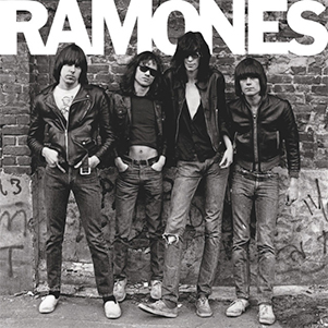 Allegedly, American punk royalty, the Ramones, wanted the cover photo for their self-titled punk rock masterpiece to mimic that of The Beatles' 'Meet The Beatles!'; their first US-released album. Illustrator John Holmstrom described the experience of taking the shot as 'like pulling teeth', reflected in the way the grimacing four-piece stand in front of a graffiti-laden brick wall, perhaps summing up the desolation and suburban oppression bands of the original punk rock movement were so keen to revolt against.
6 ~ The Velvet Underground & Nico: The Velvet Underground
 If there was ever a more well-suited artist to design the cover of The Velvet Underground's 1967 crowning glory than Andy Warhol, I've yet to come across them. Warhol's infamously abrasive pop art style transfers cohesively onto the cover of the New York-hailing ensemble's culturally-groundbreaking record. Notable for its controversial classics such as 'Heroin' and 'Venus In Furs', detailing of drug abuse, sadism and prostitution, the elements of 1960s pop culture projected lyrically and artistically through the album and its cover are indisputably avant-garde and cutting-edge.
5 ~ London Calling: The Clash
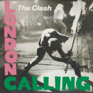 There's no doubt that The Clash's 'London Calling' epitomises the very essence of the original 1970s wave of British pub rock/punk music, its cover photo depicting bassist, Paul Simonon proceeding to smash his Fender Precision Bass against the stage at The Palladium in New York City in September 1979, the year of the album's release. Frontman, Joe Strummer and graphic artist, Ray Lowry reportedly thought the photo, taken by the band's photographer, Pennie Smith, perfect for an album cover, later described by Q Magazine as capturing 'the ultimate rock 'n' roll moment - total loss of control.' Interestingly, the pink and green lettering, in homage to the typographical style of Elvis Presley's self-titled 1956 debut album, is what makes the cover so visually striking.
4 ~ Nevermind: Nirvana
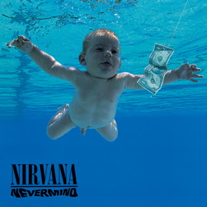 Arguably the album that first brought alternative rock music to a wider audience, Nirvana's 1991 is probably revered just as highly for its offbeat and satirical cover art as it is for its grunge-heavy hits such as 'Smells Like Teen Spirit', 'Come As You Are' and 'Territorial Pissings', with which the band are almost synonymous. The design, first conceived by frontman, Kurt Cobain whilst watching a television programme about water births with drummer, Dave Grohl, features then-baby, Spencer Elden, naked, submerged in water and vacillating towards a dollar bill, an allusion to crippling 20th/21st century consumerism perhaps?
3 ~ Screamadelica: Primal Scream
 What's particularly notable about the cover art for Primal Scream's 1991 neo-psych classic, 'Screamadelica', is the fact that it seemingly strives to be as abstract and idiosyncratic as possible, with no tangible link between the painting by Creation Records' in-house artist, Paul Cannell, and the album's thematic and lyrical meaning. The album itself is significant in that it strays away from the band's earlier staple indie rock sound and experiments with a lighter and more instrumentally-diverse narcotics-influenced house vibe, its aspirational and hedonistic aura encapsulated in the simplicity of its artwork.
2 ~ Dark Side of the Moon: Pink Floyd
 Pink Floyd's discography boasts a whole host of potential album covers to be featured in this list, with many of them featuring work from the legendary late Storm Thorgerson, and of course it's inevitable that 'Dark Side of the Moon' would be my first choice. The cinematic 1973 release from undoubtedly one of Britain's greatest psychedelic rock exports exhibits perhaps the most complex and conceptually-advanced cover of the ten albums featured in this list, not least because of the way its design represents three overarching elements; the band's lighting, the album's lyrics and keyboardist, Richard Wright's wish for a 'simple and bold' design.
1 ~ Abbey Road: The Beatles
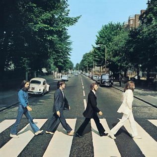 In what is perhaps the most idolised and imitated album cover in musical history, The Beatles walked nonchalantly across the infamous Abbey Road zebra crossing back in 1969 and, quite simply, made history. A fundamental component of popular culture and major influence on modern music, the album was groundbreaking in terms of musical success and a timeless reminder of The Beatles' irreplacable musical impact, all derived from a few basic sketches from Paul McCartney's imagination.
'Imagination' certainly seems to be a key theme here, wouldn't you agree? Unconventional choices though some of these album covers may be, they all portray similar innovation and symbolic genius, firmly cementing them at the forefront of the attention of generations and generations of music fans. What album covers would you consider iconic? How important is artwork in a band's musical legacy?

No comments:
Post a Comment